Create graph of bytes/s in open office from a Wireshark trace file


Since Im not studying for anything "official" at the moment I'm trying to learn more about the various tools I use most days. Hopefully there will be some useful posts in the coming days to help me stretch my memory muscle a bit :p
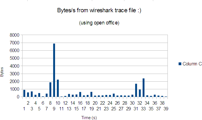
This post shows how you can create a graph in open office (excel works too) from the output of a Wireshark trace file. For this example I'm just going to graph bytes/s against time. At the end the output should look something similar to this and can be done in less than a minute when you know how.

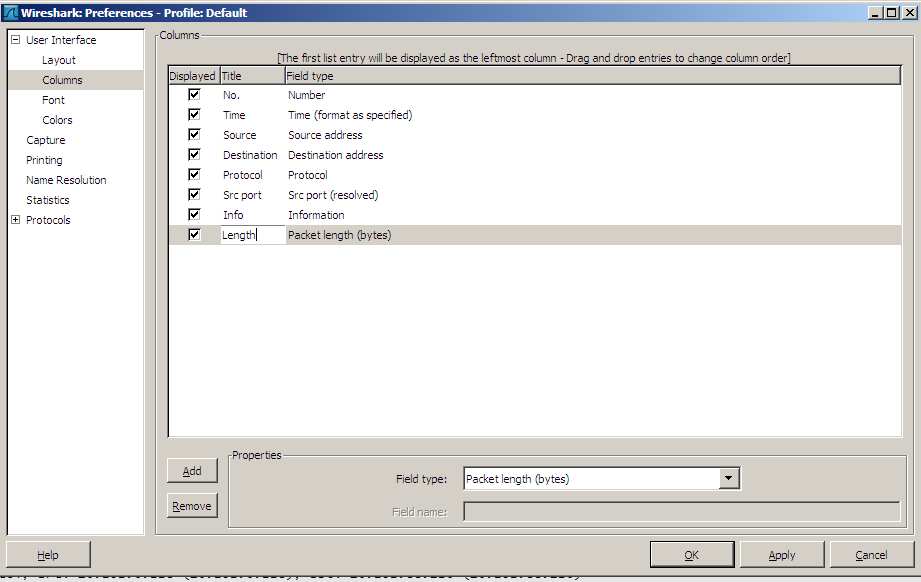
First off open wireshark and capture some traffic or you can open a pcap file exported from something else e.g. Cisco ASA ;). Then we need to add some columns that are not shown by default in Wireshark. Right click on any of the column headers and select column preferences then click add. Highlight the newly item and pick packet length from the field type menu. You can click the title and type in your own custom title for the new column too. E.g. below
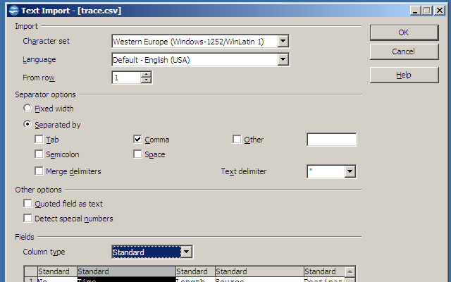
Now we can export the file but since I only want my granularity to be per second I've edited this under View > Time Display Format > Seconds before the export. To export its simply File > Export > File and make sure you pick CSV as the file type. Filters for specific packets etc can be added to the export. Now thats us done with Wireshark we can close it down and open the CSV file with Open/Libre Office or Excel. When importing its important to pick separated by comma only (quoted field as text shouldn't be ticked).
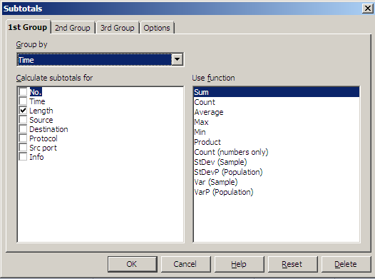
Now we should have a nicely formatted spreadsheet that includes the two columns we are interested in, Time and Length. Now we need to create subtotals for each second so we can then create the graph. So go to Data > Subtotals. Now we Group by Time and calculate subtotals for length (make sure the Sum function is selected).
Now for each second (or your chosen value of granularity) we have the total number of bytes passed. On the top left of the spreadsheet there are three tabs numbered 1-3. 1 shows only the grand total of all the bytes seen which isnt of any use to us at the moment. 3 shows the whole spreadsheet with subtotals after each second. 2 shows only the subtotals for each second and the grand total. Click 2 then highlight all the totals but excluding the grand total (or your get a massive spike at the end of the graph). With them highlighted Select Insert > Chart and follow the guide and you should have something like this.
m00nie :)